Last month, Joe Parker-Rees’ winning design for EOSC’s fresh look, chosen by you, was rolled out. With the European-wide contest, the EOSC Association aimed to connect with young European design students to visualise the transformation of research in Europe. Participants were invited to capture EOSC’s mission of supporting the digital transformation of research and its driving role towards more innovative, collaborative, and effective research.
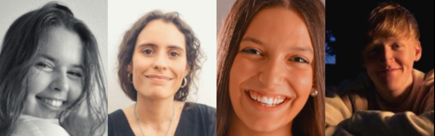
From the nearly 200 submissions, three designs, submitted by Rita Carqueija, Joe Parker-Rees and the team of Maria Carneiro and Luísa Rocha Lino, made it to the shortlist. Who are the people behind the designs that made it to the final round? To get to know the four of them, we asked them about their journeys into design as well as their ideas for the new EOSC logo.
Empathy, ink bottles and the benefit of mistakes
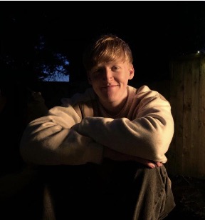
As a child, Joe remembers being fascinated by the different ink bottles his father, a children’s book illustrator, kept in his studio. At home, creativity was encouraged from a young age. Nowadays, he’s in his third year of Leeds Arts University.
During a course, in which he got to experiment with a variety of creative disciplines, he was introduced to graphic design. It was love at first sight. “I was drawn to the intensive research and iteration. The opportunity to experiment within specific parameters, while producing a piece of work that performs a specific function, really appealed to me.”
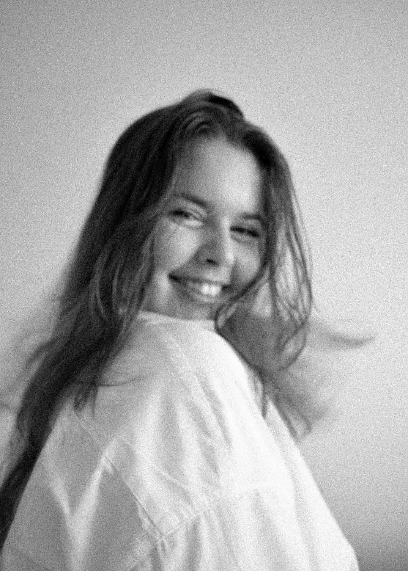
Rita Carqueija is based in Porto, Portugal, where she pursues a master’s degree in Design at Aveiro University. She always wanted to follow a path in arts and her family and friends supported her in that direction ever since. Yet, what to choose from the wide array of possibilities in arts? Guided by her high school teachers, as well as doing the homework on available programmes and talking to students about their experiences, she decided upon a course in design. Things truly fell into place for her during her studies. Her teachers in design have been a source of inspiration and have motivated her to learn more. To her, it has been key to learn the importance of critical thinking and empathy in this profession, as “design is about finding problems and developing solutions to these problems”. Knowing that she is one step away from making a difference in the world brings her joy.
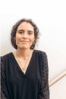
For the EOSC logo contest, Maria Carneiro and Luísa Rocha Lino teamed up and submitted a proposal together. Also based in Porto, Portugal, they are pursuing a master’s degree in Graphic Design and Editorial Projects at the University of Porto’s Faculty of Fine Arts. Luísa grew up surrounded by designers. Long before knowing what she wanted to do professionally, design was part and parcel of her environment. Her years in school turned out formative, as she got to experiment with various fields of design and learn which area she identified with most. In contrast, Maria’s journey into design was not so straightforward. At first, as a “science girl” the world of design was new to her. However, when entering university, she chose design. During her second academic year she fully realised that this was her path.

Apart from their academic education and work experience, watching online videos, from how-to explainers to official courses, as well as experimenting with graphic design software and other tools have helped the finalists hone their skills. A key lesson for Joe was the importance of creative freedom. He realised how much joy he got from choosing projects that resonated with him, those that reflect his interests and passions. Rita discovered the power of making mistakes during her studies. For someone who dislikes mistakes, it was a major insight for her that in design, avoiding mistakes is impossible. On the contrary: “I’ve learned that the more you make mistakes, the better your solutions will be to the problems you encounter, and thus, you arrive at the best you can do.”
Connection, typography, fluidity
Maria and Luísa learned about the contest through their university. They loved the idea of transmitting their ideas internationally. Never having participated in a contest like this before, they tried their luck. For their design, they chose to connect the EOSC letters to symbolise the relationship between the countries of the European Union. The rounded shape relates to the cloud graphics. Their approach focuses on legibility and clarity, resulting in a versatile logo that is easy to integrate with other projects.
Rita had just discovered how much she enjoys developing corporate identities. Searching online to do more of this work, she found out about the contest. An idea for the letter E popped up immediately. She decided to enter a new territory for her: To develop a typography for a logo. “It was an incredible challenge for me, because each letter of the alphabet is assigned its own intricacies in terms of visual appearance and how we all recognise them. To respect that, it was a very interesting exercise.” Trial and error, coupled with feedback from friends and family, helped her reach a solution that satisfied her.
Logo design and corporate identity were a relatively new area for Joe. When his tutor brought the contest to his attention, he saw it as a great opportunity to broaden his skills. He researched EOSC’s brand philosophy, the portal’s aesthetics and related websites. “I was interested in communicating EOSC’s position as an established environment for innovative research, whilst also evoking a sense of freshness for the brand. After deciding to just feature the lowercase abbreviation, it became imperative that I continued the flow and movement of the letterforms. I think the success of my logo comes from this fluidity between logo and typography.”
Current and new challenges
What are they working on now, and what’s something they would like to do next?
In addition to finishing the first year of her master’s degree, Rita is working on various projects. One is the development of an alternative set of toxicity warning pictograms for the EU. She hopes that ultimately this new system will be approved, legislated and implemented throughout Europe.
The current focus of Maria and Luísa is to finish their master’s degree at the University of Porto. When that is done, they want to pursue freelance projects together.
Joe has just finished a web experience for an album by British hip hop artist M.I.A. He enjoys web design projects and would love to do more of that. However, he is open to any type of project, as long as it challenges him creatively.